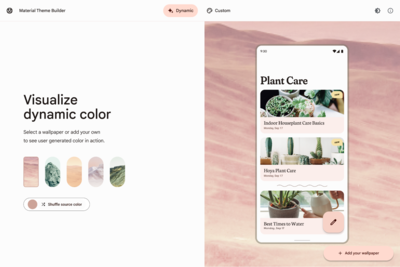
Unveiling Material You theme in Google Chore: here is what You Need To Know
Google Chrome introduced the Material You theme with updated icons and the removal of the lock icon from the address bar. The last transformation occurred in 2018 during the transition to the Google Material Theme.


Google announced its plans to revamp the browser with a fresh look and new features. The redesign will feature corners, updated icons, and the elimination of the lock icon from the Omnibox ( address bar and search field) to symbolize HTTPS security. Instead, there is a setting icon that provides access to the menu options for connection security, page permissions, cookies, and site data.
Google blog post stated that Chrome's icons have been refreshed with a focus on legibility and new color palettes have been created that better complement your tabs and toolbar. These new themes and distinct colors can help you distinguish between profiles like your work and personal accounts, at first glance.
Google has also combined with an operating system so that your Chrome preferences can easily adapt to OS-level settings, like dim and light modes.
Notably, a new drop-down menu on the far left displays all currently open tabs and recently closed ones.
Another addition includes icons with outlined styles and hollowed insides. Quick access to bookmarks, reading lists, and history is facilitated through the side panel icon located next to your profile icon. The history is now categorized, allowing for easier navigation through pages opened on a specific keyword
Additionally, icons include outlined styles and hollowed insides. Quick access to bookmarks, reading lists, and history is facilitated through the side panel icon located next to your profile icon. The history is now categorized, allowing for easier navigation through pages opened on a specific keyword.
These new changes are designed to improve the user experience, and the incorporation of the Material You theme will offer users a refreshing look and feel while browsing the internet.


